Company Branding
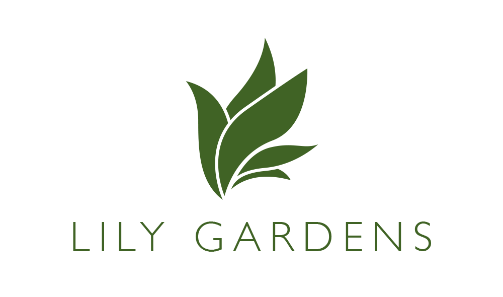
Lily Gardens needed a logo represent their company. They initially suggested a drawing of a madonna lily, but I felt that a close rendering of a lily, while visually beautiful, would not resize well. I started working by making sketches of a lily flower, then refining and simplifying until I got to a mark that i liked. This mark, a simple interpretation of a lily flower opening, would resize nicely, work in black and white or color. I chose Gill Sans Light, an elegant sans serif font, to pair with the mark. The logo was also intended for use across different lines. I came up with treatments for logo use in various products. The simple logo lends itself well to different color treatments.